IN THE COMMENTS to my post about the “Into the Tunnels” artwork, John Massey said he wanted to know more about the cover to Monsters! Monsters!, a picture I painted in the late 70s. I put in on my “hmm, maybe sometime” mental list but little more than that.
Then, Ken St Andre wrote in his blog about the cover last week himself, after he unearthed the original he’d bought many decades ago. The synchronicity of those two things leads me to talk about this in my post today.
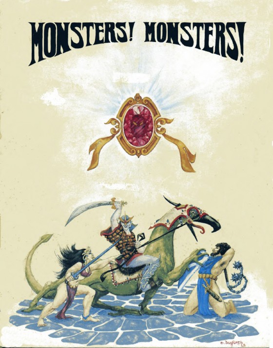
Here’s the picture. Follow me over the jump for my thoughts on it.

ANCIENT HISTORY
First of all, one’s early works always make an artist wince. Cringe. Want to spork one’s eyes and bleach the brain. In many ways, this is like that for me.
Yes, I can look at it knowing it was the best I could do at the time but I’m glad that I’ve gotten better. Moreover, I can see elements that have stuck with me. It’s funny to see I was still using “e. danforth” for my signature, and not the simple “danforth” it evolved into. This was one of my first published paintings (the date looks like 1976), although I’d been selling them awhile at convention art shows.
For those of you who don’t know what Monsters! Monsters! is — and I expect most of you wouldn’t have any reason to — it was regular fantasy role-playing turned on its head. Rather than playing adventurers fighting their way into dungeons deep and dark, players took the role of the monsters who came out of those troll-holes for a little payback. Where else did the dungeons acquire such a store of gold, gems, and magic dornicks for the adventurers to loot the following weekend?! The rules were T&T’s basic rules for combat and magic — the races of the characters being played was what made it different.
Flying Buffalo still sells the original game. While you can find it for sale elsewhere (for less), no other publisher has the rights to this game. Should you want a copy, I encourage you to pick it up only from the publisher (Buffalo) who supports the creative efforts of the people who wrote and illustrated it. (‘Nuff said.)

Ken says he can’t remember why I painted this piece. Well, I remember. It wasn’t something I painted randomly that he decided to attach to the game. The cover and all the interior illustrations were commissioned by Steve Jackson (now of Steve Jackson Games) who was working for Howard Thompson’s Metagaming company. Ken says Monsters! Monsters! came out in 1977, so I’d bet we were working on it the previous year, given the date on the signature.
I’m also betting Ken paid me fairly well for the painting. He was gainfully employed whereas I was perhaps a minimum wage cashier at a Wendy’s knockoff-clone. I had been making and selling art regularly, and Steve Jackson had already had me illustrate the first edition of Melee, but it would be years before I could call myself a serious career-freelancer.
While I often let originals go cheaply to friends, I believe in the oft-repeated edict that people value what they pay for more than what they get for nothing. It is a lesson artists (and all creative people) must learn, to value what they do, to respect themselves enough, to expect others to pony up their own hard-earned wages to acquire a piece of what we do.
THE SCENE IN QUESTION
There’s a lot about this piece that amuses me in various ways, today. The main thrust of the painting is to illustrate the conflict between ordinary adventuring types (the man and the woman) versus the “monsters” typified by the orc on his beaked mount. Don’t ask me what that rider-beast is; I have no idea. I don’t think I had any critter in mind, in particular, when I painted it.
We were playing at least as much M!M! as regular T&T back then. We tended to roll up new monsters for each session, not building a stable of individual characters. One memorable occasion, our monster-characters razed the city of Khosht, burning down the metropolis most of our adventurers called home. Bear Peters, playing the GM of Khosht, rebuilt the place through the unofficial city magistrate and local head cheese, the wizard Bjorn the Great (who was also Bear’s main adventuring character). Bear is a superbly fun GM — if you ever have opportunity to play with him, do it! He often runs adventures at Flying Buffalo’s micro-mini T&T convention each summer (July 20-22 this year).
 THAT GEM
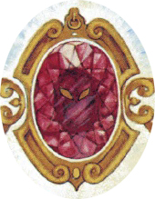
The red gem in the picture was a nod toward the awesome magic dornick my main character had in the regular T&T world. We all played multiple characters, but inevitably a few were played more often, leveled up higher, and acquired more weird shit along the way. For me, that character was Random, a distant Shadow of Amber’s princeling (for reasons that should be obvious if you read my discussion of the City of Terrors cover).
He — eventually “she” because Steve McAllister couldn’t keep the character’s gender straight while me-a-female was sitting across the room, and in a paroxysm of GM-godhood changed the character’s gender one session — had all manner of amazing stuff, including the gem that became relatively iconic for her, floating along in midair behind her shoulder. The M!M! cover needed something beyond the fighters, and the gem fit the bill rather nicely as something for them all to be fighting over.
Those of you who read my tale posted in the Fiction department of this site, Imp Possible Situations, might recognize another iteration of that fabulous gem.
TECHNIQUES
When I say the painting makes me cringe, it isn’t false modesty. It’s because in many ways, this isn’t a painting but a colorized graphic design. I thought it was a painting because I dipped a brush in damp pigment to create the colors, but the resemblance ends there.
I recall the piece was painted in gouache on illustration board. Why that medium? I can’t rightly recall. I know it was a medium of choice for many old pulp cover painters. I liked being able to lift off flat color to produce highlights — that’s why the cobblestones look like they do. I used gouache for a lot of my earliest color work.
Mostly I see a complete lack of knowledge about color theory, shadow-and-depth, background/foreground, shape and value, and pretty much every other technical aspect aspiring painters would learn in Basic Art School 101. For better or worse, I am largely self-taught, and even now some of that remains elusive. My greatest strength, now as then, lies in composition and design.
Yet even there I remember having made a conscious decision that seemed right at the time, but isn’t. I see Frazetta’s influence in the triangular composition, and in the woman’s headress and costume (although I made damn sure to imply that she just was as dangerous an opponent as the man). The composition is nicely balanced, but too stable for the combat action it is supposed to be about. It’s much too static.
HALF-NEKKID PEEPLES!
Speaking of the woman and her costume — or lack of it — I have not forgotten my promise to talk about fantasy clothing and armor, sexiness, sexism, and gender issues back in September’s post about The Summoner artwork. Every time I tackle it, the topic gets all turny and twisty, and will probably take more than one post. I may just have to make it an on-going series, the way I have these “Pictures Have Stories” series.

For the moment, I draw your attention to the fact that my sense of gender balance about half-naked people simply means the guy is no better dressed than the woman. Did the monsters’ rampage get them up out of bed, and they threw on the nearest clothes before charging out to defend their neighborhood, weapons in hand? Maybe. And she’s wearing that headgear because… um… let me think…
See, this is why they pay me the big bucks to come up with stories and games.
*chuckle*
And that’s the story of this picture.
Thanks, Liz!
Always fun to hear stories about the old days and the stories behind art that I remember well. (Although the copy of M!M! I had was the Flying Buffalo version with a pen and ink cover, inspired by but different from this one).
BTW, if I remember correctly, the edition of M!M! I had identified that beast as a Snollygoster, whether it swas supposed to be one when you painted it or not. 🙂
Right! There was a “one minute later” version of this; I’d forgotten!
Yep there sure is another version of this cover! In many ways’ it is a “lost” piece of Liz art as it only appeared on the old Monsters Monstersrules and was printed in brown ink on brown paper with Red overlays – making it difficult to really see the beautiful Liz Danforth details. Maybe you’ll get to see it soon… we’ll see…
By way of comparison, here is a link to the Melee cover:
http://boardgamegeek.com/image/69374/melee
Note the “early Danforth style” of discrete figures converging on a common center (the triangular composition Liz mentions). Back in high school (yeah, I’m old), the idea of a GAME that you could carry in your back pocket and play was way cool (hey, we were Geeks before Geeks were cool). The artwork was engaging and made us want to explore this strange new world of heroic fighting fantasy. We could BE those characters from Lord of the Rings (a series of books before they were a series of movies) and slug it out.
And since not everyone knows of Melee, the counters were filled silhouettes of various heroic fantasy figures of both genders. Back then, the well accoutred Hero/Heroine wore, wait for it:
http://4.bp.blogspot.com/-JqFgAuNzPa4/TW8hZBY2X9I/AAAAAAAABTQ/J6GAtTNDZ5I/s1600/bell%2Bbottoms.JPG
Yes, those are BELL BOTTOMS: Disco Dragon, anyone?
oh, and SUBSCRIBED 😀
Nope David, the cover of Melee you linked is NOT my artwork. 🙂
As for the awesomeness of bell bottoms… it’s been observed on many another occasion! Reason? I couldn’t draw boots and shoes particularly well! Certainly not in such small bits. And heeeey…. Steve Jackson never complained!!
Here is your array of Melee covers… http://boardgamegeek.com/thread/953991/who-was-the-artist-for-the-cover-of-melee-wizard-a
Still, the actual LD Melee cover offers a companion look to those ol’ days. And I did peg the bell bottoms 😀